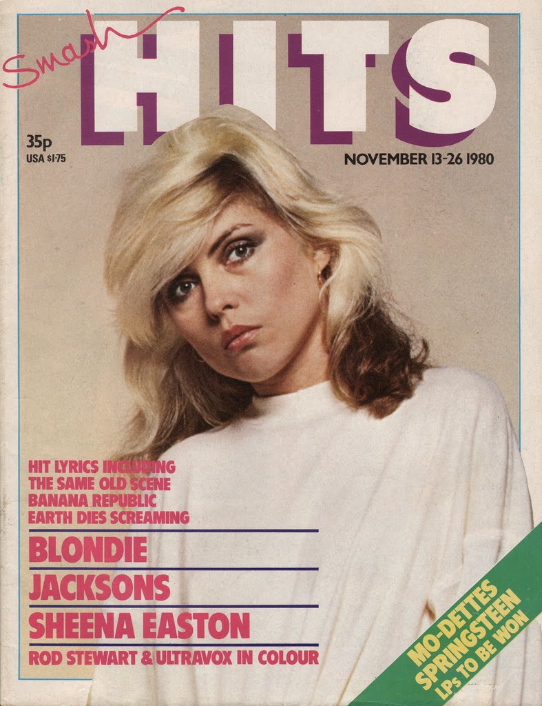
The front cover that I will be analysing is Smash Hits, as it is an old magazine and it's style is very vintage. This magazine concentrates on the most popular songs at the time that it gets released. I really like the design of it and they busy nature of it, therefore I feel like analysing it will help me with my research and will help me find what I should or shouldn't pick when creating my own magazine later.
The Masthead

The
masthead takes up a large section of the cover, and is very unusual, as it breaks the
conventional style of mastheads, because it is in
serif font, and has yellow and black shade, which makes it pop and look 3D and what I have discovered in vintage magazines, is that many of them have the 3D effect, and that it is almost
conventional for them to be 3D. It is the lightest thing on the whole cover, as the letters are white, which makes it stand out. I like the
kerning of the title, and what I also noticed it that most of the
mastheads on most vintage magazines is similar.

What is interesting is that this music magazine does not have a
housestyle, as it differs with every issue, so does they
layout, for example:
I believe that it differs in order to fit with the hits that are released at that time, which I find interesting, as I thought that most of the music magazines would try to avoid looking different, especially with
mastheads.
However, this magazine has been published for 28 years, which could portray that the change of the
housestyle would mean that the magazine wants to modernise and change in order to fit the same
target audience, however from a different generation.
The Image

The
central image of the front cover includes the female model, who is in
direct address with the customer, which is one of the
conventions of photos in music magazines. Her facial expression is a mischievous smile, and due to the fact that the only thing she has to cover herself up with is the feather scarf suggests that the photo falls into the theorists
Laura Mulvey's 'Male Gaze' theory, which says that women are viewed for the pleasure of men, which can be clearly seen in this picture. The model has heavy eyeshadow on, which is used to attract the viewer to her face.
The fact that the main
headline says that 'Kylie Grows Up' suggests that she has grown as a woman, and not literally which can be portrayed in this photo. The
white space behind her is dark red, which is a
connotation for lust.
This photo also follows
Richard Dyer's theory, as you can tell that she was told to make that facial expression and to pose like a coquette, therefore, 'A star is an image, not a real person' because she wouldn't look or act this way around everyone, she only posed for this magazine in order to please the
target audience.

The Cover Stories

On the left side of the magazine, the cover stories are mostly written in
box-outs, and the images have colourful frames which make them look more in the foreground than the background. The
fonts used are mostly different, some in width and some in style or colour. Many words that are by themselves are in
box-outs in different colours to drag attention.

On the right side of the magazine are all of the
puffs and there are no pictures, which makes it a little more dull, however this is changed when bright colours are added to the text, and some of it is highlighted using
box-outs in contrasting colour to the
white space. There are
leads which are or other artists who are included in the magazine at the top, along with a
tag.
At the lower half of the cover there is a quote which takes up a large section of the page compared to the other text. It is related to the main story and is used as a
kicker, in a way it is also a
caption of the
central image since it explains the main story and the image used to support it. The quote marks are larger than the quote itself which makes it the reason the reader looks at the quote.
Extras

There is a
pug at the top right corner of the front page which makes the reader interested in buying the magazine for the sheer reason of being able to win something. It is a distinct blue colour which contracts with the background of the front cover, and makes this small detail important and bright.
How this research has influenced my planning
- I know how to create effective puffs and pugs
- I now know how to make effective cover stories
- I know how to add effective secondary leads

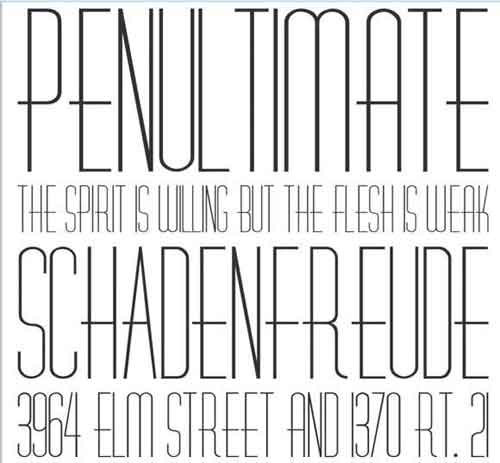
 I like this font because the kerning is lovely, and I would like it to be similar to this, however, the little decorations on the letters are not too appealing to me, and I would prefer it not to have any. Also, I wish it was all capitalised, and there would be no drop capitals.