

This font that I found is lovely, I love the narrowness of it, and that it is in all capitals, however, I find the little dips in the bottom of the letters unappealing, and I wish it was sans serif. I love everything about this, apart from the missing 3D effect and the little decorations. However, the 3D issue could be fixed, as the effect can be applied using photoshop.
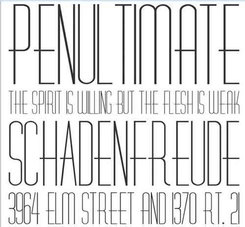
I like this font because it has lovely kerning and it's width is very thin, which I would like to apply to my masthead. However, I do not like the fact the top of some letters have a smooth curve instead of edgy ends, like the masthead of Vintage Rock, or Gothic Tuscan.
What I also have realised, is that this font may be a little too modern for my liking and for my genre, therefore I know for sure that this won't be the font I will use for any parts of my magazine.
No comments:
Post a Comment