Wednesday, 12 October 2016

Monday, 10 October 2016
Research front cover 4: Q

The front cover that I will be anaylsing is within the category that I have chosen to do for my own music magazine, vintage. It is interesting that it is Q that I will analyse, because I discovered that it's masthead wasn't always the brilliant red. A long time ago, it was a mustard yellow, when they had a different editor, and their conventions were different.
The Masthead
 The masthead's background colour is a worn mustard, which gives me the impression of the 80's/90's which makes it very effective,however, in that era having 3D fonts were more conventional than 2D, which technically breaks them. The deep black of the masthead itself stands out compared to the stained yellow box-out. I really like the contrast of the colours, especially the fact that the box-out isn't too bright. The font itself is in serif, which makes it look very smooth and is very pleasing to the eye. The letter is very wide (which personally I do not like too much) and is very large. It's placement is at the top right corner, which hasn't changed at all throughout the years, and became Q's housestyle.
The Image
 What is very interesting it that the central image isn't exactly in the centre. It is located at the bottom of the front cover, and isn't as large as the central images usually are,therefore it adheres to conventions of any music magazine, including vintage. That (in my opinion) leaves the front cover looking rather unfinished, as it leaves a lot of whitespace.
The band have a very casual look,which is odd because the stone roses are a rock band, and if you didn't know them you could never tell and they are not wearing anything outrageous, which can imply that they aren't trying to stand out from everyone fashion wise, but they only concentrate on their music. Their facial expressions are very casual, however, they still look posed and positioned because of their stances and poses. This reflects on Richard Dyer's theory, as they are stars that 'are constructed.'. What is odd, is that even though they have been positioned to pose like that, they still don't look like they are trying too hard, which is what I love about this central image so much. The fact that they aren't dressed to impress anyone challenges Laura Mulvey's theory, which is Male/Female gaze.
 However, after looking at the central image and then the heading for it, the image starts to make more sense to me. They are posing this way because they are acting out the heading, they are asking the reader: 'What are you waiting for?'. So their casual style actually means that they are challenging the world with their style and their music.
The Cover Stories
 The overall layout of the cover stories is very unusual because they are placed higher than the main story, and overall take up more space than the main story. What is also very interesting is that almost all of them include secondary leads, and have bright colour, including this Prince story, which actually looks more rock than the main cover story, which is also very unusual. What is also unconventional is that because it has such a dark background, it makes it stand out on the pale whitespace. and because of that this was the first thing that I looked at on the magazine front cover.
This little cover story creates a connection with the reader, and forms prosthetic personalisation, as it asks the reader: 'Remember your first gig?' which makes it sound friendly and approachable. It also makes the purchaser nostalgically think of their previous experiences, which is related to the magazine.
The colouring of the secondary lead is very tinted orange, but makes it stand out compared to the plain whitespace. The style of the photo is very basic, which makes it appear very 'pop art'-like.
 This cover story is the only one without a secondary lead, however, it is large in font, which is unusually white compared to the rest. The box-out of it is a checkered shirt background, which links to the story directly, in an amusing way.
These two cover stories are placed in a very unusual place, which is directly next to the masthead. However, these photos do not have a large amount of background to them, which makes them blend in more.
Their headings are in striking black, which contrasts to the whitespace, and makes them pop.
The Extras
 As unconventional and odd as this front cover may be, it still sticks to some traditional conventions, such as having a barcode at the bottom corner of the front cover.
 The other convention that it sticks to is having a pug, at the top corner, in bright colour with buzz words which attract the reader and tempts the reader to purchase this magazine.
How this research has influenced my planning
- I now know that in order to have a vintage masthead, you mustn't make it 3D
- I now know that the main picture does not always have to be at the centre
- I now know that I will possibly include a sharp looking pug
- I know the importance of picking a good layout and whitespace
Saturday, 8 October 2016
Fonts
Here are some fonts that I found on the interned which I like, and I think they would be suitable for my magazine's masthead, however, I haven't decided which font I like the most yet.
 I like this font because it looks shiny because of the extra lines on the letters,however, I would like the kerning to be smaller, and the letters to be a little more narrow. Also, I would like it to have a little 3D effect, which is conventional of vintage music magazines.
 I like this font because the kerning is lovely, and I would like it to be similar to this, however, the little decorations on the letters are not too appealing to me, and I would prefer it not to have any. Also, I wish it was all capitalised, and there would be no drop capitals.

This font that I found is lovely, I love the narrowness of it, and that it is in all capitals, however, I find the little dips in the bottom of the letters unappealing, and I wish it was sans serif. I love everything about this, apart from the missing 3D effect and the little decorations. However, the 3D issue could be fixed, as the effect can be applied using photoshop.

I like this font because it has lovely kerning and it's width is very thin, which I would like to apply to my masthead. However, I do not like the fact the top of some letters have a smooth curve instead of edgy ends, like the masthead of Vintage Rock, or Gothic Tuscan.
What I also have realised, is that this font may be a little too modern for my liking and for my genre, therefore I know for sure that this won't be the font I will use for any parts of my magazine.

 I like this font because the kerning is lovely, and I would like it to be similar to this, however, the little decorations on the letters are not too appealing to me, and I would prefer it not to have any. Also, I wish it was all capitalised, and there would be no drop capitals.
This font that I found is lovely, I love the narrowness of it, and that it is in all capitals, however, I find the little dips in the bottom of the letters unappealing, and I wish it was sans serif. I love everything about this, apart from the missing 3D effect and the little decorations. However, the 3D issue could be fixed, as the effect can be applied using photoshop.
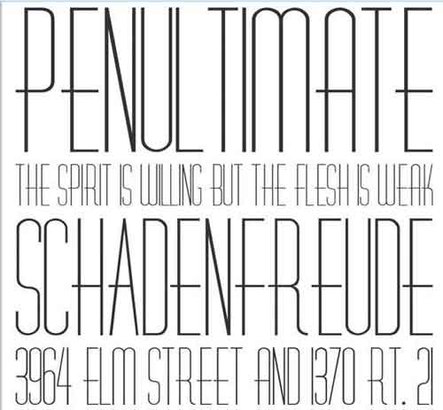
I like this font because it has lovely kerning and it's width is very thin, which I would like to apply to my masthead. However, I do not like the fact the top of some letters have a smooth curve instead of edgy ends, like the masthead of Vintage Rock, or Gothic Tuscan.
What I also have realised, is that this font may be a little too modern for my liking and for my genre, therefore I know for sure that this won't be the font I will use for any parts of my magazine.
Mood board for my theme
This is the collage that I have created,which links to my chosen theme for my music magazine, and possible themes/colours/props I might use that I created on Slidely. I really like using this little tool, as it creates a great finish, and makes it look lovely, also it has a wide range of things you can use, and I will definitely use it again in the near future.

Friday, 7 October 2016
Links,synergy and brand identity


The magazine Metal Hammer has synergy throughout all of their issues, and in this one, the iconic masthead has not changed in comparison to the previous one because it is their housestyle and creates their identity. The gold used on the front cover is not used in the contents page which means that it is not type of synergy in this magazine.
Metal Hammer has a brand identity, as you can see, that even though there isn't much red, the brand's name is in bright red. This is continued to the contents page, which involves hints of red on puffs.


The contents page has many photos, which are laid out beautifully, also, looking at the style of it you can tell that it is definitely a Metal Hammer contents page, because of the style of photos, drop capitals and the colour codes. Also, the fonts used for the contents puff looks rigged and aggressive, which makes it look hardcore. The repeated use of blood red and their masthead creates strong synergy between their institution, the front cover and the contents page which makes it recognizable from the rest.

The contents page has quite a lot of text wrapping, even though it is very busy. This can also be seen in other issues, which can only mean that this is a convention that Metal Hammer has decided to use in between all of their issues and to make it part of their synergy and housestyle. I really like the way it is carried out and therefore I will consider using a similar layout for my contents page, when I create my music magazine to make it recognizable compared to the rest.
The masthead/logo of the magazine can be seen several times on the contents page, which defines it's brand identity, as due to that you will never mistaken it for another magazine's contents page.
Sunday, 2 October 2016
Research front cover 3: Smash hits
 The front cover that I will be analysing is Smash Hits, as it is an old magazine and it's style is very vintage. This magazine concentrates on the most popular songs at the time that it gets released. I really like the design of it and they busy nature of it, therefore I feel like analysing it will help me with my research and will help me find what I should or shouldn't pick when creating my own magazine later.
The Masthead

The masthead takes up a large section of the cover, and is very unusual, as it breaks the conventional style of mastheads, because it is in serif font, and has yellow and black shade, which makes it pop and look 3D and what I have discovered in vintage magazines, is that many of them have the 3D effect, and that it is almost conventional for them to be 3D. It is the lightest thing on the whole cover, as the letters are white, which makes it stand out. I like the kerning of the title, and what I also noticed it that most of the mastheads on most vintage magazines is similar.
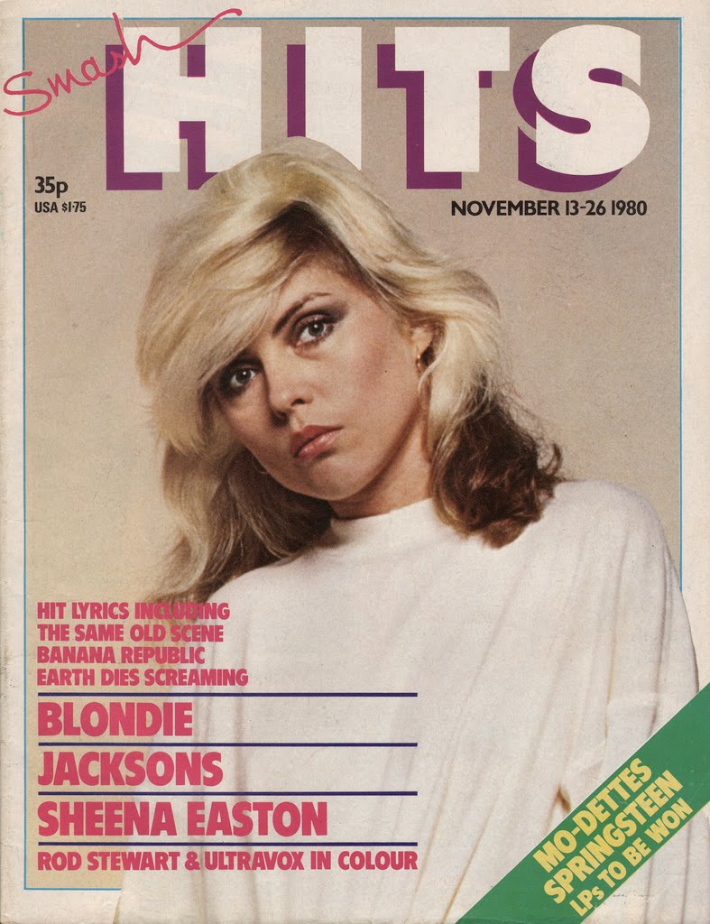
What is interesting is that this music magazine does not have a housestyle, as it differs with every issue, so does they layout, for example:
I believe that it differs in order to fit with the hits that are released at that time, which I find interesting, as I thought that most of the music magazines would try to avoid looking different, especially with mastheads.
However, this magazine has been published for 28 years, which could portray that the change of the housestyle would mean that the magazine wants to modernise and change in order to fit the same target audience, however from a different generation.
The Image

The central image of the front cover includes the female model, who is in direct address with the customer, which is one of the conventions of photos in music magazines. Her facial expression is a mischievous smile, and due to the fact that the only thing she has to cover herself up with is the feather scarf suggests that the photo falls into the theorists Laura Mulvey's 'Male Gaze' theory, which says that women are viewed for the pleasure of men, which can be clearly seen in this picture. The model has heavy eyeshadow on, which is used to attract the viewer to her face.
The fact that the main headline says that 'Kylie Grows Up' suggests that she has grown as a woman, and not literally which can be portrayed in this photo. The white space behind her is dark red, which is a connotation for lust.
This photo also follows Richard Dyer's theory, as you can tell that she was told to make that facial expression and to pose like a coquette, therefore, 'A star is an image, not a real person' because she wouldn't look or act this way around everyone, she only posed for this magazine in order to please the target audience.

The Cover Stories

On the left side of the magazine, the cover stories are mostly written in box-outs, and the images have colourful frames which make them look more in the foreground than the background. The fonts used are mostly different, some in width and some in style or colour. Many words that are by themselves are in box-outs in different colours to drag attention.

 On the right side of the magazine are all of the puffs and there are no pictures, which makes it a little more dull, however this is changed when bright colours are added to the text, and some of it is highlighted using box-outs in contrasting colour to the white space. There are leads which are or other artists who are included in the magazine at the top, along with a tag.
At the lower half of the cover there is a quote which takes up a large section of the page compared to the other text. It is related to the main story and is used as a kicker, in a way it is also a caption of the central image since it explains the main story and the image used to support it. The quote marks are larger than the quote itself which makes it the reason the reader looks at the quote.
Extras

There is a pug at the top right corner of the front page which makes the reader interested in buying the magazine for the sheer reason of being able to win something. It is a distinct blue colour which contracts with the background of the front cover, and makes this small detail important and bright.
How this research has influenced my planning
- I know how to create effective puffs and pugs
- I now know how to make effective cover stories
- I know how to add effective secondary leads
Subscribe to:
Posts (Atom)