
Friday 2 December 2016
Thursday 1 December 2016


Friday 25 November 2016
TA Survey Analysis
In order to make an effective music magazine, I wanted to know what my niche target audience are looking for, and created an easy survey which will allow me to make effective decisions whilst editing my magazine. I have handed out my survey to ten people and have gathered the answers which will lead me to make conclusions in relation to the design, stories, context and links to social media. After gathering all of the information, I have placed them into individual pie charts in order to make it also visually clear what answer is most popular.
My first question was in order to help me with deciding on the size of my masthead and possibly colour, it was 'Would a large logo/masthead of a magazine grab your attention from a shelf? And these are the answers that I have received:


Yet again, I expected to see the majority of answers to agree that a bright element is important, and the answers delivered. I will use bright elements on the front cover, however I will not make all of it vibrant, as it will look lower quality and will not stick to most conventions of Vintage magazines.
My third question was: 'Is a big central photo with a quality/interesting pose important?'. I asked this question as I wanted to know what style of photos and poses I should try on the front cover of my magazine to make them appeal to my specific niche audience, as I had to get that right in order to gain customers. These were my results:


My first question was in order to help me with deciding on the size of my masthead and possibly colour, it was 'Would a large logo/masthead of a magazine grab your attention from a shelf? And these are the answers that I have received:

I did expect the majority of the answers to say Yes, however, I also expected at least one or two participants to say no. Nevertheless, no matter what the votes would have been, I would still use a relatively large masthead, or at least elements of it to grab attention of readers.
My second question was asked so it would help me make decisions on what sort of colour schemes I should look at, as I did not know whether I would use a vibrant or a toned down colour scheme. These are the results that I have received from the 10 participants:

My third question was: 'Is a big central photo with a quality/interesting pose important?'. I asked this question as I wanted to know what style of photos and poses I should try on the front cover of my magazine to make them appeal to my specific niche audience, as I had to get that right in order to gain customers. These were my results:
Because my central photo is rather serious this has made me reconsider using a different one, and so I posted a draft with a more youthful, cheery photo, however, I feel that it appeared more like a fashion magazine that way, and so,for now, I am leaving the original photo for the front cover, unless I take a better photo.
Question number four was in regards to know for what reason does my audience purchase magazines in general, so I would be able to know what style of article I should write for my double page spread.
Referring to Blumer and Katz I have asked what type of article they would be interested in:

Because I have concentrated on the personal story of my star,which isn't very uplifting but rather inspiring, I still have tried to appeal to the results, and so I have added elements of humour in it, by using rude language in occasion to make the article more entertaining for the young audience. However, if I had an older audience that would be over 40, taboo language would not be used as it is considered unacceptable for people who are older.
My fifth question was asked in order to aid me to choose the suitable colour scheme or something similar, so not only would the cover stories intrigue them,but also an aesthetic colour scheme. Here are the results I have received:

I have tried to make the masthead a pastel/cream colour, however it looked horrendous and so I did not use these results on my magazine and instead I have used gold and red, which are both from the remaining results, and seemed to appear nice together.
Question number 6 was asked in regards for me to know if I should have more than one photo on my front cover, not to make it only appear busy using text, but also image, and the results I have received are quite interesting:

It was a tie, and because of that I was not sure what to do, and just left it without for the time being, however, if I would select interesting photo/s and they would look appealing and nice on the front cover, I'd keep it on.
Because I am unsure as to how much I should charge for my magazine, I have asked approximately what price they would be willing to pay, for question 7 I have asked if they would be willing to pay more than four pounds for a music magazine, and these are the results that I have received:

Since my price was ever over £4, and was £2.50, I have decided to possibly raise the price to £3, depending on the quality of the paper. As I would not like my quality to be like Kerrang!'s but rather like Vintage Rock or MOJO's I have thought that it would be reasonable to raise the price by 50p.
Because my niche audience is young, interactive and very much involved within social media, I have decided that it would be a smart idea to ask them, how and what do they use to consume music? This question allowed them to choose more than one answer, which would then allow me to gain better, more accurate results. And this is what I received:

By looking at this data, I believe I should definitely add some links to Spotify, YouTube or Apple Music, as they seem to be the popular choices, and would definitely bring success to any music magazine.
Blumer and Katz believed that there were different categories of people who consumed media for different purposes: For entertainment, information, or being able to escape their daily lives and being able to relate to what they are reading. Reflecting on these theorists I have formed one of the questions to figure out why my specific audience would consume print media, and what they are looking for in an article, and these are the results:

Because such a large audience is looking for amusement, in my DPS article, I have been adding humorous elements to it, and some taboo language to make is acceptable and relevant to teenagers, as they tend to find it more amusing than an older audience.
The price that I have decided on, I believe the quality of the paper must be important as well, and it also depends on whether the issues are weekly or monthly, and I believe that if it is monthly, the quality must be very good.
Because 7 out of 10 believe that the quality of paper must be good, I have decided that if I would print my paper, it would be a better quality than Kerrang.
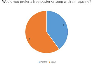
The audience is linked with modernity and use social media a lot, I am not sure whether they would like a free song from iTunes, or a free poster, and so I asked them what they would prefer to get with an issue, and these are the results:

I expected this to happen, because more than half would like to get a free song legally, I will possibly do a scan code which would allow them to get a free song from an artist of the week to their phone/device.

Thursday 24 November 2016


Survey

This is the survey that I have handed out to my niche audience, and have analysed the gathered questions.
Monday 14 November 2016
Article for the DPS
JP: unmasked
I was always told I would never be able to make it in
the music industry simply because I’m a woman.
‘You play the bass? But you’re a girl!’ I was told
throughout my life. I simply don’t see why that is so amazing. If a man can do
it, so can I.
Losing my mother at such a young age was an odd
experience, because I don’t remember her touch or her love as much as I would
want to. At that time, I don’t think I was aware of what dying or cancer was,
so I just spent the days with my mum as I would usually do, the place just
changed from our garden to the hospital room, where she would lay in bed,
hooked to a scary machine that would make noises, but one day the noises just stopped,
and so did the visits. She never came home like she promised.
After I lost her, I didn’t realise what will happen,
but the rest of my family were always there through that sad and confusing
time.
I picked up an acoustic for the first time at the age
of 8, the same year my mother passed. I recall wanting to try and play it
because my mum would listen to our grandad play for hours. I would beg and
whine at my grandad, asking him to teach me the basics of it. I always wanted
to be like him, sometimes I even mimicked his actions! He saw my growing urge
to pick up and play with instruments, he let it blossom, and I am ever so grateful
for that. As I experimented with drums, I knew that wasn’t me, then, at 9, I
tried electric lead, that didn’t work either. So, for my 10th
birthday, I received the gift that changed my life, a bass guitar, from a
person who made me who I am, my grandpa.
From that day, I spent hours every day trying to
master this beautiful and underestimated instrument, and with my granddad and
my father by my side, I thought I could accomplish anything. I didn’t need any
professional lessons when I had him by my side, and a year after I knew the
basics and so much more: how to bolt-on-neck, humbucker, all of that was done
and dusted, and knew what waited ahead and what was yet to be learned by my
mentor.
All was doing well, and I continued to improve and
become stronger by the day, we even formed a little band in secondary school with
a few of my mates, which helped me learn what the actual place of my role was,
and how it was the backbone of the band. It was all going to amazing, I felt
like I was in cloud nine, until one night, it all hit rock bottom in one phone
call- my grandad had died in a hit and run accident, and there was nothing that
could have been done about it. No witnesses, no evidence. I was 16 when it
happened, and I felt a part of my heart and soul crumble to pieces when I have
found out what has happened. I started to sleep less, I missed school, I put my
bass to the side for the first time. Life became black and white for me, and
nothing interested me. I didn’t even notice how depression took hold of me, it didn’t
matter to me at all. I was busy mourning and being selfish, I didn’t celebrate
his life and I didn’t carry on his legacy. After two years did it finally hit
me, that this is not what he would have wanted, so I picked up his prized
four-stringer and marched outside, in the middle of a star filled night and
began to play once more, and it was as if all of my hatred and sadness left me
in one chord.
At that same night, I said to myself ‘Fuck it.’ I dropped
out of college, which I just started, and became a self-taught full time
bassist, and started to sneak out to bars at night when my father went to
sleep. Usually the nights ended the same, with a boot kicking me out. But one
cold night in January of 2005, I stumbled into a little bar called ‘Nightjar’
in London, and saw half a band packing up after a little show. Being hopeless
at that point, I thought ‘It can’t get any worse at this point, it won’t hurt
to talk.’ And so, I marched towards the two guys who were packing away what
appeared to look like a lead electric and a drumkit. They picked up on grandad’s
bass over my shoulder straight away, and after exchanging a few words and
numbers I have gotten myself my one and only band.
Like grandpa always said ‘meet the right people, shake
the right hands and you will be on your way to success.’ And I knew at that
point, that someone as insignificant as us will make history.
So, we started drifting across the UK, anywhere we
could: pubs, gigs, little festivals… as long as we were accepted we were on our
way. I remember it as if it was yesterday: 2006. Manchester, warm July nights
and we were setting up on the stage in some pub when we saw David Grohl and his
whole gang sat at a table, unnoticed. My heart started pounding and I my palms
sweating, I ran towards Mike and Jase and whispered: ‘Holy shit its Dave Grohl
sat there! We better make an impression, play your asses off!’
And so, we got into our positions, our nerves spiralling
out of control as the legendary band listened to every little note we have
produced. It was the longest hour or so in my life, you could feel the tension
between us, but as the time passed, we started to relax, and towards the end I was
too enthralled and entangled with my role, we ended the night as usual, with
little dances and jumps, moves to the beat on the scene.
As always, there were applause from the public, and as
my eyes danced across the space, looking at every pleased face, my eyes
interlocked with Grohl’s. It was the most intense eye contact I have ever had
in my entire life. After that, there was no turning back. I had to do this.
Jumping off the platform, I marched towards the infamous band and exchanged
hello’s, received compliments and after a while, when both bands had a few
pints and laughs, he spurted out: ‘Hey, you guys seem pretty cool, I see
potential. How about we get you a recommendation?’ The moment we heard those
words our eyes lit up and we became children, intoxicated with joy. To our embarrassment,
we spend about half an hour thanking them. The night ended with a few exchanges
of information that was that.
The next month was endless calls and performances, for
the first time we performed in a real studio! After masses of improvements and
endless effort, we released our first album, and it has been such a success,
with my share, I have managed to help out my amazing father with paying off his
debts. After the birth of the first album, the second one came along, and we
are halfway through producing the third one. Not only that, we are planning on
touring this year in America!
And now, when I look back at all of this, I could have
been no one if it wasn’t for my family support and the amazing people that I have
met during my journey, and I am ever so grateful.
So this is me, and this is my story.
Sunday 13 November 2016
Moodboard for the next photo shoot (slidely)

I have created this collage for the following photo shoot in order to get a better idea of what makeup, hairstyle, costume and poses I would like so it would make is easier to direct my model as to what they should pose as, and how I should dress and prepare them.
One of the suitable companies that could publish my magazine
I have recollected that I have done some research on Bauer and that it concentrates on two types of audiences, and one of them is the same as my music magazine.
They have the specific audience called 'The millennials' :

I have also looked into their magazines, and the only ones that have hints of vintage, as the music magazines that they own are Q, Kerrang! and MOJO. None of them concentrate on vintage music, or music from the past, so I believe that my magazine could be supported by them as they have a gap in the market for that specific genre in this target audience.
Because of how huge and popular Bauer is, if my magazine would be supported by them it would be beneficial for the both sides.
If my magazine would appear in their list of brands, it would be where the red circle is, in between Trout and Viking:

Saturday 12 November 2016


Tuesday 8 November 2016
Analysing 3 front covers: who are the TA?
I have decided to take a look at a few different magazine star images and how they reflect on the specific audience that they are targeting to buy their magazine.

This star image is rather aggressive due to the facial expression, and the gestures, the type of tattoos automatically create a connotation (to me personally) of a rapper, maybe a member of a gang even.
The fact that the hand is so close to a camera and is showing a rude gesture implies that this person is trying to get to your face and almost grab your attention in a negative way.
I believe this star image attracts a young male audience, aged approximately 17/25, as that age is the most popular out of the whole to listen to rap/gangster style of music.
Overall the photo is very conventional of such a genre because of the choice of plain simple clothing which reveals tattoos, which are a connotation for being hardcore/metal, and that is exactly what I believe is trying to be achieved in this specific shot.
What I like about this photo is the angle, that it is a subtle low angle shot, even though it can be barely noticed, and the only thing that gives it away is that the model has to look slightly below to make eye contact with the camera.

This photo of Madonna is lovely, and the fact that she is wearing slightly revealing clothes automatically links it to Mulvey's male gaze theory, just as does the red lipstick with it's connotation for sex,lust and danger, however, I believe it would attract both of the genders. Her pose interestingly looks rather natural because of how she has her hand in her hair, as if she brushed it away softly in between the shots but someone managed to capture it.
Because of this and because I know how long she has been making music this photo targets a wide range of audience, which can be slightly older and modern because she still creates music which engages young audiences too.
The fact that it is a young, careless photo of her also makes her more appealing to the younger audiences.
Overall, I believe the ages can very from as much as from 16/35 or even above, because some of her first singles were released in the 1980's.
 This photo is creative, and was taken in an interesting pose, avoiding eye contact, which makes the model appear as if she was in the middle of dancing, which makes the photo peculiar, and not conventional.
The photo is interesting because it is a medium/medium long shot which is not conventional of music magazines, as usually stars have their photos taken from closer.
But because of it's style, choice of clothing and makeup I believe this photo is aimed at a younger female audience.
I believe it would attract them because of how uncommon it looks which attracts the young audience in this day and age.
I believe that overall the age of the audience would be from 15/19, which is more narrow than either of the photos above.
How this research influenced my planning and creativity:
- I know that different poses, facial expressions and gestures will appeal to different ages and genders
- More brave/unusual poses will attract younger audiences which seek to stand out.
Sunday 6 November 2016
TA profile research
Greta M's Slidely by Slidely Slideshow
By creating this video I have researched visually what my TA could possibly be interested in as hobbies or beliefs. I think this research will help me to realise what my audience enjoys which will help me make my magazine intriguing for that specific audience.
By looking at Blumer and Katz, I have used their theory to get an insight on my audience and what would get them to buy my magazine, I have tried to use personal gathering and surveillance, as it will make them not only get the magazine for enjoyment but also for useful information.
Overall, I think my main target audience would be Tribe Wired and fun, which would then be broken down to reformers and possibly individuals referring back to the personal aspirations.
Tuesday 1 November 2016
Locations

Even though I would not be able to take photos like this for my photoshoot because it is winter and this was taken abroad, I think this would create a romantic connotation for my star, which is not what I would like my star to be, therefore this wouldn't be suitable. What would be another issue is that if I would take a photo at a similar time the lighting would not be appropriate for photos, as it would be completely too dark for anything.

I really like this place as it is quite exotic and the colours are rather feminine and warm, however, this was also taken abroad, and I would not be able to take a photo there. However, I loved this place as it had a hint of nature and femininity because of the flowers. I would have loved to take a photo of my star wearing a floral dress here, as it would not only match with her outfit, but would be a connotation for her being exotic and different to every day, feminine and unconventional.

I do like this place a lot but it would be more suitable for a jazz or a classical magazine, as the subtlety of the instruments and the feel and style of that style of music is more gentle and natural in comparison to vintage music, which is related to grunge and similar styles...
My Star Image
Article and representations:
My own star, would be 19 years old, and her article would be about how even though she is a bassist and a female, and how unusual it is, but how she accepts the fact that she is the uncommon. She would be dressed not in a revealing way, but rather a male gaze, referring to Laura Mulvey's theory.
She will be a confident, and sure of herself.
The story will be fun and interesting, and not in a Q&A fashion, but rather as a story, as if we've experienced this journey together which will create a prosthetic personalisation between the reader and the star.
When she poses for the photos for my front cover and contents pages, she will be confident, cheeky with interesting and wild facial expressions at times.
Her poses will be lady-like at some photos and wild, intriguing ones in other areas.
She will clearly be a built star, exactly how Dyer would describe a famous person: 'an image, not a real person' that has been built by others, and in this instance it will be me.
There will be symbolism in some of the photos, for example colours, makeup or poses...
consolidating my ideas research: DPS
I now know I will use page furniture in order to make my DPS more interesting, as I would like my DPS to look sophisticated and intriguing at the same time, but not too childish. I will use an effective colour scheme which will allow me to create synergy. I will use an interesting photo of my star for my DPS, maybe in a different location, as it would make connotation about my star image. I will use left justification in text as it is easier to style and it is conventional for text to have left justification, not right or central.
I would like to use a drop capital in order to grab the reader's attention away from the photo and the headline.
I would like to use a foreground to heading technique on my photos to manipulate layers and make it look more interesting.
I would like to use drop capitals to grab attention to the actual text and not the photos.
I would like to use drop capitals to grab attention to the actual text and not the photos.
Monday 31 October 2016

Consolidating my ideas research: contents page
I would like to use an interesting layout for my contents page, for example, a large photo in the middle, and text wrap on it, to make it more interesting. What I would like to have in my magazine is strong synergy in between my front cover,contents, so that the reader would still be aware as to what magazine he is reading.
The style of my photos should be retro, some in black and white and some rather bright in contrast. I would like some of them to be naturalistic and not making eye contact with the photo, I would also like some to break some conventions but not too much.
I would like to have different styled fonts, with different kerning, size, style of font and colour in order to split the information clearly ,and the page numbers to either be on the photos or the side of the text.
I should make it clear as to what genre my music magazine is even on the contents page, so it would be clear to the reader without doubt that this is the genre that they will be reading about.
I know I would like more than photo on my contents page, so it would be more intriguing than just one simple photo.
I would also like to have a colour scheme to my contents page, an editor's note and little details as such in order to have that professional finish in the end.The style of my photos should be retro, some in black and white and some rather bright in contrast. I would like some of them to be naturalistic and not making eye contact with the photo, I would also like some to break some conventions but not too much.
I would like to have different styled fonts, with different kerning, size, style of font and colour in order to split the information clearly ,and the page numbers to either be on the photos or the side of the text.
Consolidating my ideas research: front cover
These are the things I have liked/disliked from all of the front covers that I have researched:
Since I know how important the colour scheme is depending on the genre of the music magazine that you want to create, I will ensure mine will be bright and joyful. Not only are details such as those are important, but also links to social media are essential as they are one of the key things to attracting a young teenage audience.
I now know how to make effective cover stories , so that they would intrigue a reader to pick up the magazine, and I hope to use this on my own magazine. I will also add effective secondary leads, as it will help me create a high quality front cover.
The main picture does not always have to be at the centre, but I would like mine to be as close to the centre as possible. I will possibly include a sharp looking pug to grab the attention to the reader.
Front cover research 5: Q

What I really like about it is the colour scheme, and how the cover stories are placed around the central image.
What I find odd is that the whitespace is so plain, however it is effective and actually looks good, having a busier whitespace would drag the attention away from the central image, the cover stories and possibly the main headline.
The masthead
 The iconic Q is in the red box-out as always, with it's housestyle white serif letter, which is placed at the top right hand corner as usual.
However, what is unusual is that there is a little slogan just above the name, in the boxout. Q does that at times, but not usually, this break it's own housestyle and convention, which I find rather odd.
What is also odd about the use of the masthead overall is that in some issues, the masthead is brought to the foreground and hides parts of the central image, depending on size. However, on the equal amount of time it is brought back and parts of the central image go on the foreground of the box-out, just like in this instance, that the model's hair and slight part of head is seen in front of the masthead.

The Image
What I like about the central image is that it's placement is not exactly central, as it is carefully composed alongside the actual cover stories. I also like the pose of The Smiths, however, their facial expressions look awkward and forced, which I find rather unattractive in a photo.
I also really like how the colour scheme of pink is accompanied by the strong black and white effect placed on the photo.
The Cover Stories
 The main cover story is large, and bright because of the fiery pink, and small kerning ,sans serif font.
I love the size of the name of the band and the fact that such a colour is used as it is considered not masculine, it is very unconventional for a male band to be accompanied by such a colour.
What I also really like about this cover story is that there is a pull quote from possibly a review that states how they feel about the band. I will consider using something like this for my own magazine, as I feel it is very effective.
What I also really like is that 'The' is in a little box out, and even though it is plain black, it still manages to stand out just as well as the magnificent pink. The underlined text is in bold, and the words themselves intrigue me as a reader because of how dramatic they sound, and therefore act as a lead.

Sunday 30 October 2016

DPS research 4: MOJO

How this research influenced my planning and creativity:
- I now know I will use page furniture in order to make my DPS more interesting
- I will use an effective colour scheme such as this one
- I will consider taking a similar style photo for my DPS with my star.
Research: Q&A style articles (FLEA)
I have analysed a Q&A to learn how to form such style interviews and how to make them interesting to read, and I hope this will help me with writing in the future.

My favourite part of this article is this beautiful photo and how it is the centre of the article. It is a full body image and I really like how text wrap is used around the photo, and it is the main thing of the article- the artist that the article is about.

My favourite part of this article is this beautiful photo and how it is the centre of the article. It is a full body image and I really like how text wrap is used around the photo, and it is the main thing of the article- the artist that the article is about.
Saturday 29 October 2016
DPS research 5: MOJO
After planning out my own DPS I have struggled with the main photo and what it could possibly look like,the layout, the colour scheme and the size of page furniture.

This research really helped me with the creative thought of my DPS and how far i can go with outrageous photos that are fun and interesting. Not only did the photo help me but also how the title of the article can intrigue people who enjoy specific things, so for instance, this headline would interest people who care about fun and wild reads.
However, after doing a little research on this DPS I have been influenced with new ideas.

This research really helped me with the creative thought of my DPS and how far i can go with outrageous photos that are fun and interesting. Not only did the photo help me but also how the title of the article can intrigue people who enjoy specific things, so for instance, this headline would interest people who care about fun and wild reads.
Thursday 27 October 2016
Star images in magazines

 I will be looking at some star images and how they are portrayed in magazines, in hopes of it helping me figure out what type of star image I want to create by making my model pose, act, look, and express in a single photo, such as these:
Axl Rose and Dave Grohl, how they differ and what their poses are achieving.
Looking at Axl Rose's pose (Left), the dramatic shadow on his face makes him look intimidating, and the cold facial expression with the slightly tilted face makes him look rather threatening and serious,this suits his heavy rock genre very well. The way he is dressed, black, and a hint of pink from his bandanna is an interesting combination which goes against the convention of a rock star.
Overall,this photo is very serious, dark and intimidating in comparison to the light, black and white but more exposed shot of Grohl. Also, the direction at which he is pointing is his band name, and the slightly opened mouth makes him appear nice and friendly, as if he would be saying 'Hey, this is my band, you should check it out!'. This is important because the genre of his music is much lighter in comparison to what Guns N Roses perform, and therefore appeals to the audience which would be looking at the magazine.

This star, Kurt Cobain, was posing in a natural way, and makes this photo look as if he was unaware of it being taken at the first place.
It is in black and white, and a medium close up. Cobain is not facing the camera/audience, but rather looking intensely at someone.
This sets an overall serious tone of the magazine itself, and is a connotation of the style of his music, as it was never easy going, it was rather heavy and in minor, serious tones. The reason this photo could be in black and white is because of the lead which explains that Cobain has been dead for 10 years, and could be so serious because of respect for him, his talent and music.

What is also very different is that all of the members are wearing bright yellow suits with black flowers on them, which makes the picture overall rather vibrant. The yellow contrasts with the purple whitespace because they are opposites reflecting on the colour wheel. I believe this was chosen on purpose and is a connotation, makes the reader think that this band will be vibrant and fun to listen to.
 Whilst looking at all of these star images I have found that semiotics are very much so important, and not just of the star and the posing, but the links to everything that is on the front page at times as well. A good example would be this, The Stone Roses, their picture being clearly unposed as you can see how natural the group's embrace, and how real their emotions towards each other are. What I really love about this photo is that they are truly appreciating each other, and this links to the headline of their possible article in the magazine: 'Adored' which is also one of their songs. I love the links between every stage and I aspire to reach connection which is at least similar to this in my own star, the image and the link to the remainder of the magazine.
What I adore about this image of the star on the front magazine is that it is also unposed, and even if it is, it looks extremely naturalistic. I want to achieve such emotion in my own star, for the viewers to see how passionate my musician is about what they do. I also love the posture of the singer and how the banner us placed in between his legs. This singer breaks conventions by not having a direct eye contact with the reader, just like most of these do and that is what I have noticed is usual in vintage/retro magazines,therefore I might consider not using direct eye contact with the reader myself.
Using a full body shot for a front cover is rather interesting, however it is not conventional of most vintage magazines, therefore I might not do that, unless I decide to challenge them in the near future.
How this research influenced my planning and creativity:
- I would like to play with the foregrounds and backgrounds of my photos just like the last photo
- I would like my photo to be as natural as possible
- If it is visibly posed, I would like it to be lighthearted and not end up looking menacing, instead friendly and approachable.
Subscribe to:
Posts (Atom)