
Monday, 17 October 2016

Initial ideas creativity: Double Page Spread.
I have thought about the design of my double page spread, and I think that having one large photo on the page would be perfect. It would be the main article of the magazine, and it would be of the model that was posing for the front cover central image of my magazine. The photo would be the model posing cheerfully, preferably sat down on an object. I have not yet decided on a colour scheme, however, I would like the start of the article to have a massive drop capital, because I really like the way it makes the article appear. I have found some lovely examples to show approximately how I would like the drop capital to look:


I aim to use a drop capital in a similar way to this one, as it looks very interesting and grabs your attention due to it's size compared to the rest of the text, this is the effect that I would like to achieve myself.
I would like my text to have more than one column, and be nicely arranged, which would make it nice and easy to follow and read. The text itself would be aligned on the left side, but probably not on the left. However, if I decide to break this convention I might align the text on both sides of the column.
The title of the text would be large and easily noticeable, and in a funky vintage font which would create synergy between the front cover, the contents page and the double page spread.
Initial ideas creativity: contents page
For the contents page, I will make look rather busy, as there will be a large amount of photos which could possibly be the larger section of the contents page. I would like to have somewhere around 8 photos, which would all differ in sizes and style. The photos themselves would have the page numbers on them, and further information would be distributed on the side of the page.
I have taken this inspiration from these contents pages:

I really liked the way the photos on this contents page are spread out, and I would like to do something like that myself. I also like how the page numbers are distributed, alongside of the photographs.

This contents page is my favourite out of any I have seen, and this is the one I got inspired most by. I love the layout, and I will use something similar, however, the information will be distributed differently, and I will use different colour schemes.
In my contents page, I will have text scattered and placed according to the placement of it's photo. The size of it will be similar, and sans serif. However,larger font will be used for little subheadings.
I have taken this inspiration from these contents pages:

I really liked the way the photos on this contents page are spread out, and I would like to do something like that myself. I also like how the page numbers are distributed, alongside of the photographs.

This contents page is my favourite out of any I have seen, and this is the one I got inspired most by. I love the layout, and I will use something similar, however, the information will be distributed differently, and I will use different colour schemes.
In my contents page, I will have text scattered and placed according to the placement of it's photo. The size of it will be similar, and sans serif. However,larger font will be used for little subheadings.
Initial ideas creativity: front cover
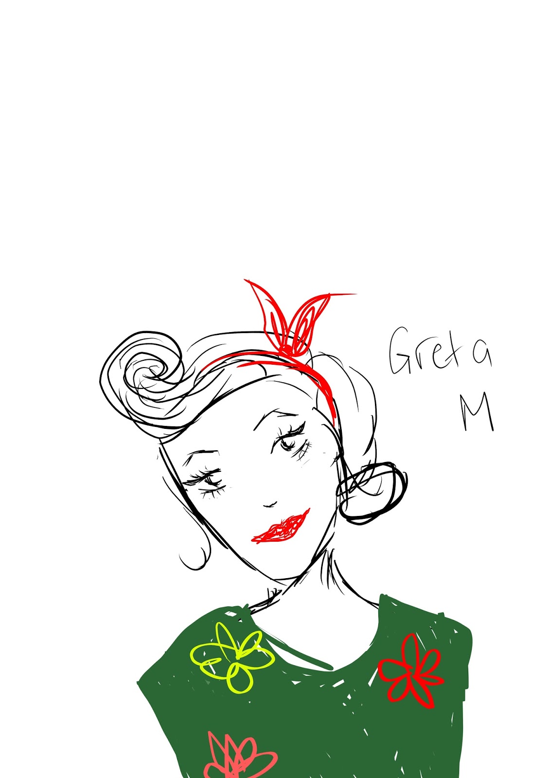
I have thought about my front cover photo, and I would like to have one star, a female who would be wearing a dress resembling the 50's style,playful heels, with winged eyeliner and pinup hair with a fabric headband and a curl in her fringe. She would be smiling and holding a guitar in a wild pose, with one of her legs in the air.
She would have a floral tattoo on her arm which would be visible and would break conventions of vintage, as tattoos are a symbol of rock. Also, since vintage guitars are electric, I would get the model to be holding one in her shoot. By using this pose and the props, I will adhere to Richard Dyer's theory that 'A star is an image, not a real person...' because of how she will be constructed and directed by me.

My second idea for a pose would be a medium close up of the model, which would be her not having any eye contact with the audience and breaking the conventions in that way. She would still be in the same dress, with the same makeup and hair but the only difference would be that she would look more mature. However, I do not necessarily want that, as I want to show to my audience (teenagers) that old/vintage is not aimed at the elder, more mature audience only. I want to show them that it has a fun spin on it, and anyone can listen to it, including them. Using this pose, I would adhere to Laura Mulvey's male gaze theory, as she would look sensible, mature and beautiful, extremely feminine. This appeals to Mulvey's theory because she will be posing to the pleasure of the male audience.

I would like the electric guitar to either be black, red or blue which would look great with the model and her dress, and makeup.
I will take these photos at a photo shoot at my college, which will allow me access to better quality props to create a great photo, however, I will take some more without them, which will allow me to work at different locations, and make it look more interesting.
I have decided that I will manipulate the colour of the photo using photoshop, to either make the colours incredibly bright and eye catching, or dimmed and stained, which will represent vintage.
However, both effects represent vintage in their own ways, so I have not fully decided on which I will choose yet, but I believe I will make this decision after I have taken the photos.
For the cover stories, I will get them to text wrap around specific parts of the magazine, and some for sure will have secondary leads which will make it appear much more interesting and busy in appearance. The font will be large and colourful, but not as colourful as the central image in order to help it stand out more. It will have a pug, a banner and a bar code, either on the side or the bottom right corner of the front cover.

The masthead will be very large, and take up a 1/5th of the page, it will have kerning and will be tall and thin, with 3D shading on it to make it appear extremely vintage, as it will adhere to the vintage convention of having any sort of effect, mainly 3D.
She would have a floral tattoo on her arm which would be visible and would break conventions of vintage, as tattoos are a symbol of rock. Also, since vintage guitars are electric, I would get the model to be holding one in her shoot. By using this pose and the props, I will adhere to Richard Dyer's theory that 'A star is an image, not a real person...' because of how she will be constructed and directed by me.

My second idea for a pose would be a medium close up of the model, which would be her not having any eye contact with the audience and breaking the conventions in that way. She would still be in the same dress, with the same makeup and hair but the only difference would be that she would look more mature. However, I do not necessarily want that, as I want to show to my audience (teenagers) that old/vintage is not aimed at the elder, more mature audience only. I want to show them that it has a fun spin on it, and anyone can listen to it, including them. Using this pose, I would adhere to Laura Mulvey's male gaze theory, as she would look sensible, mature and beautiful, extremely feminine. This appeals to Mulvey's theory because she will be posing to the pleasure of the male audience.
I would like the electric guitar to either be black, red or blue which would look great with the model and her dress, and makeup.
I will take these photos at a photo shoot at my college, which will allow me access to better quality props to create a great photo, however, I will take some more without them, which will allow me to work at different locations, and make it look more interesting.
I have decided that I will manipulate the colour of the photo using photoshop, to either make the colours incredibly bright and eye catching, or dimmed and stained, which will represent vintage.
However, both effects represent vintage in their own ways, so I have not fully decided on which I will choose yet, but I believe I will make this decision after I have taken the photos.
For the cover stories, I will get them to text wrap around specific parts of the magazine, and some for sure will have secondary leads which will make it appear much more interesting and busy in appearance. The font will be large and colourful, but not as colourful as the central image in order to help it stand out more. It will have a pug, a banner and a bar code, either on the side or the bottom right corner of the front cover.
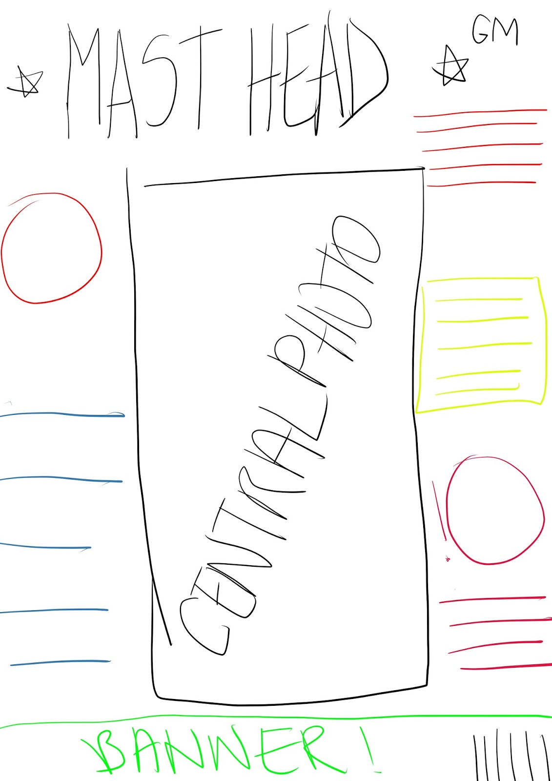
The masthead will be very large, and take up a 1/5th of the page, it will have kerning and will be tall and thin, with 3D shading on it to make it appear extremely vintage, as it will adhere to the vintage convention of having any sort of effect, mainly 3D.
Wednesday, 12 October 2016
Comparison of my front cover research
I will be analysing the different features that are used in all of the magazines' mastheads and central photos of front covers that I have researched. These will include Metal Hammer, Vintage Rock, Smash Hits and Q.
The Mastheads
 3 out of 4 of the mastheads I have analysed have serif font, which screams of the past and retro. This is mainly because after looking at a lot of magazines I have decided straight away to go for vintage.
 What is also similar on Smash Hits and Vintage Rock is that they all have a 3D effect on them, to make them stand out from the rest of the magazine, this is conventional of a vintage music magazine, as usually they have 3D effects on them.
 However, on the remaining Q and Metal Hammer, they do not have a 3D effect on them. Metal Hammer's design is overall rather different compared to the rest, as it's genre is very different.

Q is the only one out of the mastheads which has a box-out to make it stand out from the whitespace. However, it is the housestyle of Q, so it is not surprising. It does not break it's own conventions, but adheres to the usual vintage style.

What is interesting is that each and every photo is so different from each other, in styles, colours, poses, conventions and theorists linked to them.
For example, this Smash hits central image is a single model, who follows Mulvey's Male gaze theory. The way she is positioned also follows to Dyer's 'A star is an Image' theory. However, this central image is different from others because it attracts a young male audience due to it's composition. It is also the only photo which has a female model.

This central image is similar theory wise with Metal Hammer and Smash hits photos, as they all have been contructed to pose that way, and look unreal, like Dyer's 'composed star'. What makes this photo so different from the others is that it is the brightest from them all looking at the colour scheme, which makes it appear like pop art. Also ,this photo is the only one that does not have direct eye contact with the reader, however, that doesn't make it look worse than the rest, in reality, it makes it stand out the most.

This photo is similar (in a way) to Q, with the whole stone roses band posing for the central image, however, it also differs significantly to it because they are posed more strategically and are clearly told what to do, which makes it similar to Smash hits and Vintage Rock in relation to Dyer's theory that they are all stars who have been created, they're not real people. What makes this central image stand out the most is that this is the only photo that is a full body shot.
 This photograph differs the most out of all of the above, not only because of the way The Stone Roses are posing, or the way they are dressed, but because the photo is not in the centre, rather at the very bottom of the front cover.
The Mastheads
 3 out of 4 of the mastheads I have analysed have serif font, which screams of the past and retro. This is mainly because after looking at a lot of magazines I have decided straight away to go for vintage.
 What is also similar on Smash Hits and Vintage Rock is that they all have a 3D effect on them, to make them stand out from the rest of the magazine, this is conventional of a vintage music magazine, as usually they have 3D effects on them.
 However, on the remaining Q and Metal Hammer, they do not have a 3D effect on them. Metal Hammer's design is overall rather different compared to the rest, as it's genre is very different.
Q is the only one out of the mastheads which has a box-out to make it stand out from the whitespace. However, it is the housestyle of Q, so it is not surprising. It does not break it's own conventions, but adheres to the usual vintage style.
The Images

What is interesting is that each and every photo is so different from each other, in styles, colours, poses, conventions and theorists linked to them.
For example, this Smash hits central image is a single model, who follows Mulvey's Male gaze theory. The way she is positioned also follows to Dyer's 'A star is an Image' theory. However, this central image is different from others because it attracts a young male audience due to it's composition. It is also the only photo which has a female model.


This photo is similar (in a way) to Q, with the whole stone roses band posing for the central image, however, it also differs significantly to it because they are posed more strategically and are clearly told what to do, which makes it similar to Smash hits and Vintage Rock in relation to Dyer's theory that they are all stars who have been created, they're not real people. What makes this central image stand out the most is that this is the only photo that is a full body shot.

Their facial expressions are very naturalistic, which goes against Dyer's theory, because they look very casual, as if someone snapped their photo at a gathering rather than a professional photo shoot.
how this has influenced my planning and creativity
how this has influenced my planning and creativity
- I now know that I will either make my masthead really colourful or stained, possibly black and white.
- I will not have a group of people for my front cover photo
- I would like to break the convention of direct eye contact with the reader
Monday, 10 October 2016
Research front cover 4: Q

The front cover that I will be anaylsing is within the category that I have chosen to do for my own music magazine, vintage. It is interesting that it is Q that I will analyse, because I discovered that it's masthead wasn't always the brilliant red. A long time ago, it was a mustard yellow, when they had a different editor, and their conventions were different.
The Masthead
 The masthead's background colour is a worn mustard, which gives me the impression of the 80's/90's which makes it very effective,however, in that era having 3D fonts were more conventional than 2D, which technically breaks them. The deep black of the masthead itself stands out compared to the stained yellow box-out. I really like the contrast of the colours, especially the fact that the box-out isn't too bright. The font itself is in serif, which makes it look very smooth and is very pleasing to the eye. The letter is very wide (which personally I do not like too much) and is very large. It's placement is at the top right corner, which hasn't changed at all throughout the years, and became Q's housestyle.
The Image
 What is very interesting it that the central image isn't exactly in the centre. It is located at the bottom of the front cover, and isn't as large as the central images usually are,therefore it adheres to conventions of any music magazine, including vintage. That (in my opinion) leaves the front cover looking rather unfinished, as it leaves a lot of whitespace.
The band have a very casual look,which is odd because the stone roses are a rock band, and if you didn't know them you could never tell and they are not wearing anything outrageous, which can imply that they aren't trying to stand out from everyone fashion wise, but they only concentrate on their music. Their facial expressions are very casual, however, they still look posed and positioned because of their stances and poses. This reflects on Richard Dyer's theory, as they are stars that 'are constructed.'. What is odd, is that even though they have been positioned to pose like that, they still don't look like they are trying too hard, which is what I love about this central image so much. The fact that they aren't dressed to impress anyone challenges Laura Mulvey's theory, which is Male/Female gaze.
 However, after looking at the central image and then the heading for it, the image starts to make more sense to me. They are posing this way because they are acting out the heading, they are asking the reader: 'What are you waiting for?'. So their casual style actually means that they are challenging the world with their style and their music.
The Cover Stories
 The overall layout of the cover stories is very unusual because they are placed higher than the main story, and overall take up more space than the main story. What is also very interesting is that almost all of them include secondary leads, and have bright colour, including this Prince story, which actually looks more rock than the main cover story, which is also very unusual. What is also unconventional is that because it has such a dark background, it makes it stand out on the pale whitespace. and because of that this was the first thing that I looked at on the magazine front cover.
This little cover story creates a connection with the reader, and forms prosthetic personalisation, as it asks the reader: 'Remember your first gig?' which makes it sound friendly and approachable. It also makes the purchaser nostalgically think of their previous experiences, which is related to the magazine.
The colouring of the secondary lead is very tinted orange, but makes it stand out compared to the plain whitespace. The style of the photo is very basic, which makes it appear very 'pop art'-like.
 This cover story is the only one without a secondary lead, however, it is large in font, which is unusually white compared to the rest. The box-out of it is a checkered shirt background, which links to the story directly, in an amusing way.
These two cover stories are placed in a very unusual place, which is directly next to the masthead. However, these photos do not have a large amount of background to them, which makes them blend in more.
Their headings are in striking black, which contrasts to the whitespace, and makes them pop.
The Extras
 As unconventional and odd as this front cover may be, it still sticks to some traditional conventions, such as having a barcode at the bottom corner of the front cover.
 The other convention that it sticks to is having a pug, at the top corner, in bright colour with buzz words which attract the reader and tempts the reader to purchase this magazine.
How this research has influenced my planning
- I now know that in order to have a vintage masthead, you mustn't make it 3D
- I now know that the main picture does not always have to be at the centre
- I now know that I will possibly include a sharp looking pug
- I know the importance of picking a good layout and whitespace
Subscribe to:
Posts (Atom)