Q: in what way does your product use or challenge conventions of real media products?
My
music magazine challenges and adheres to many conventions of a music magazine.
Each page has its own conventions and challenges them.
I
have followed them more than challenged them to make my music magazine appear
like one at the first place, and also to look appealing to my audience.The Front Cover:
 My masthead adheres to only one convention, and it is that it's located at the top of the magazine, so the audience can tell what it is called without confusion.
However, the fact that it is two words, and how they share the first letter together challenges conventions as music magazines usually have one word as a masthead to make is short and recognizable.
For example, Q is a singular letter that is recognized because of the red box out that makes it stand out in comparison with the rest of its front cover.
However, I wanted my masthead to mold into the magazine and become a part of it instead of popping out like Q, and therefore, I have used my colour scheme and applied it to my masthead to make it look like a part of the magazine, and become part of my synergy throughout the pages.
 The font that I have used also challenges conventions, as a 2D fonts are used more than 3D fonts, as they look more flat and a part of a magazine. After doing some research on vintage magazines I have found that 3D fonts were used quite a lot, and so I have adhered to an old convention, but challenged an old one at the same time.
 The main cover story that I have created Adheres to the convention that it is the biggest story on the front cover, and is usually in the centre of the front cover, that is also a convention I have followed because that was the story I wanted to be most eye catching and to be one of the first things the audience looks at.
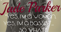
I have used one pull quote for my main cover story, to show a little insight into the article and what it will be about. It also acts as a lead for the audience as it is intriguing as to why the star image is so defensive about herself. Pull quotes are a popular technique used within front covers of music magazines due to how effective they can be, depending on the choice of words used .
I believe I have used mine successfully as it is intriguing due to repetition of certain words, and the personal tone of the star.

 I have adhered to many conventions of a music magazine and its cover stories, for instance, that they are on either of the sides of the magazine, and that they have many different fonts, and could possibly be divided by lines or little symbols which would give them a more creative feeling, and be more aesthetic. Even though my cover stories do not have a range of colour in them in order to stick with the colour scheme and the synergy, I have used little dividers like other magazines to create an original look.
 The sizes of my fonts were not too different either, however their style is and that is what made them stand apart from each other.
I have placed them on both sides so the magazine would look organised, yet busy and cluttered at the same time. I kept the cover stories not slanted because I wanted them to be easy to read and look organised, but vary them in slight size differences and fonts, also colours.
I have included a sell line within my music magazine which is a limited convention that a select group of magazines use to create an impression about themselves, which is what I was trying to do, I wanted to impress my audience with it, and attract them to read into it more, so in a way, it acted as a lead or a pug in this instance. I have located it at the top of the page, just above the masthead and kept it a small size, so it wouldn't be the most important thing on the page, but still have meaning and significance due to where it is placed.

 It is typical to see a puff to interest a reader with bright colours or interesting shapes and buzz words inside, and that is why I have decided to use a few on my front cover.
I have crafted a circular puff on the top corner of my magazine which seduces the reader by offering them something or interesting them with a word that makes the magazine appear like it holds content that cannot be found anywhere else. Even though the puffs are not bright coloured, they have exclamation marks which automatically becomes a connotation for something exciting. The baby blue for the exclusive puff may not appear bright, but in comparison with the dark fuchsia it stands out a lot for a tiny sign, and therefore I have successfully adhered to a convention.

 Finally, I adhered to one of the main conventions within music, or any magazines which is eye contact with the consumer. I have done it so the model looks like she is willing to share secrets with the audience, and this can be clearly seen as she looks happy and innocent,yet remains flirtatious with her pose, makeup and clothing. So, her looking at the audience links with the DPS and all is explained in a way in the article.
The contents page:


